Project Overview: Dunia Games is an online platform where users can stay updated on the latest gaming news, purchase game credits, and join or create custom tournaments.
My role: UI/UX Designer. I designed across web, mobile responsive, and mobile app. I was also involved in UX research activities
Team: Another designer, 1 Project Manager, and outsource Developers
Duration: 4 months
Methods: Design workshop, User Interview, A/B testing, Usability
Testing, Wireframe, Prototyping
Tools: Sketch App, InVision, Zeplin
Client: Telkomsel Indonesia
Credits: Aleph Labs
Based on a year of analytics data, 73% of users were new but made only 12% of purchases. In contrast, 27% were returning users, contributing to 88% of transactions. Most visitors came from external sources and left after completing a task. This highlighted an opportunity to improve on-site engagement, especially for new users, by redesigning the experience to encourage content discovery and deeper interaction.
Gamers, a mix of DG users and non-users were our focus. To understand their gaming behaviors, motivations, and challenges, we used a mixed-method approach combining quantitative and qualitative research.
Gaming Survey (Quantitative)
318 respondents. We ran a survey to gather broad insights into users’ gaming habits, preferences, and expectations.
Key findings:
- Users are most interested in social media for gamers (e.g., Facebook, Instagram-style feeds), the ability to create/join tournaments, and access to game information
- Competition ranked as the most important element in gaming platforms, followed by secure transactions and community interaction
- Most respondents are students or working adults who enjoy games regularly but don’t identify as hardcore gamers
User Interviews (Qualitative)
We interviewed 12 users through virtual meetings to dive deeper into user experiences and pain points.
Key findings:
- DG is seen as a source for game info and voucher top-ups
- Users mostly top up during promotions or in-game events
- Users who explored the tournament feature found it valuable, but the forum lacked community activity
- Community is essential. Younger users prefer Discord, while older users lean toward Facebook and WhatsApp
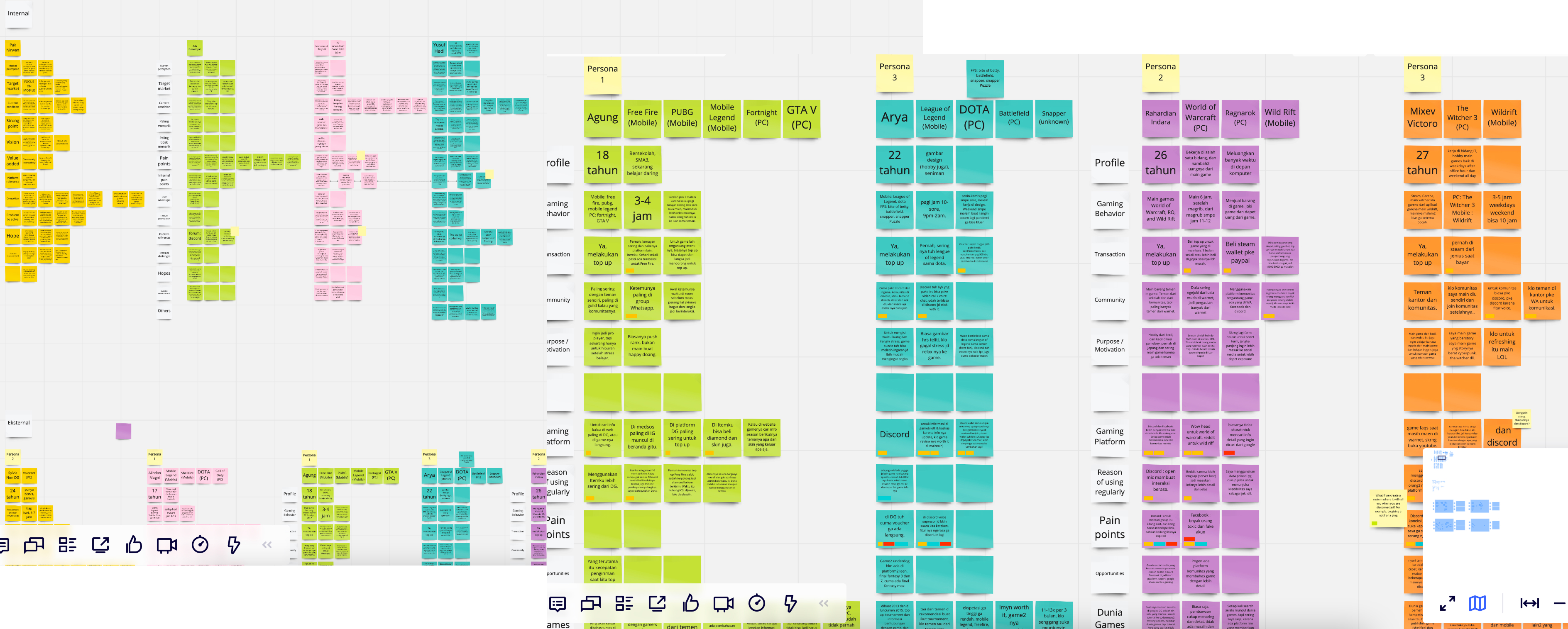
Notes from user interviews organized in Miro. Each sticky note shows something a user said or did. We grouped them into themes to help create empathy maps and personas.
The team gathered insights from both the survey and interviews. We then mapped them into empathy maps, personas, and a value proposition to get a clearer picture of our users. This helped us understand their motivations, frustrations, and what they actually need from the DG website.
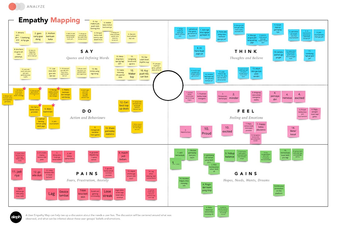
Empathy Mapping
A snapshot of what users say, think, do, feel, as well as their pains and gains — based on real quotes and behavior patterns.
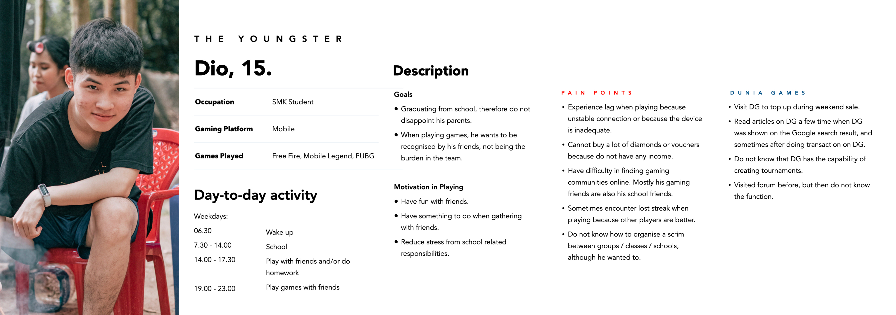
User Persona
We identified 3 key user types. Here’s one of them.
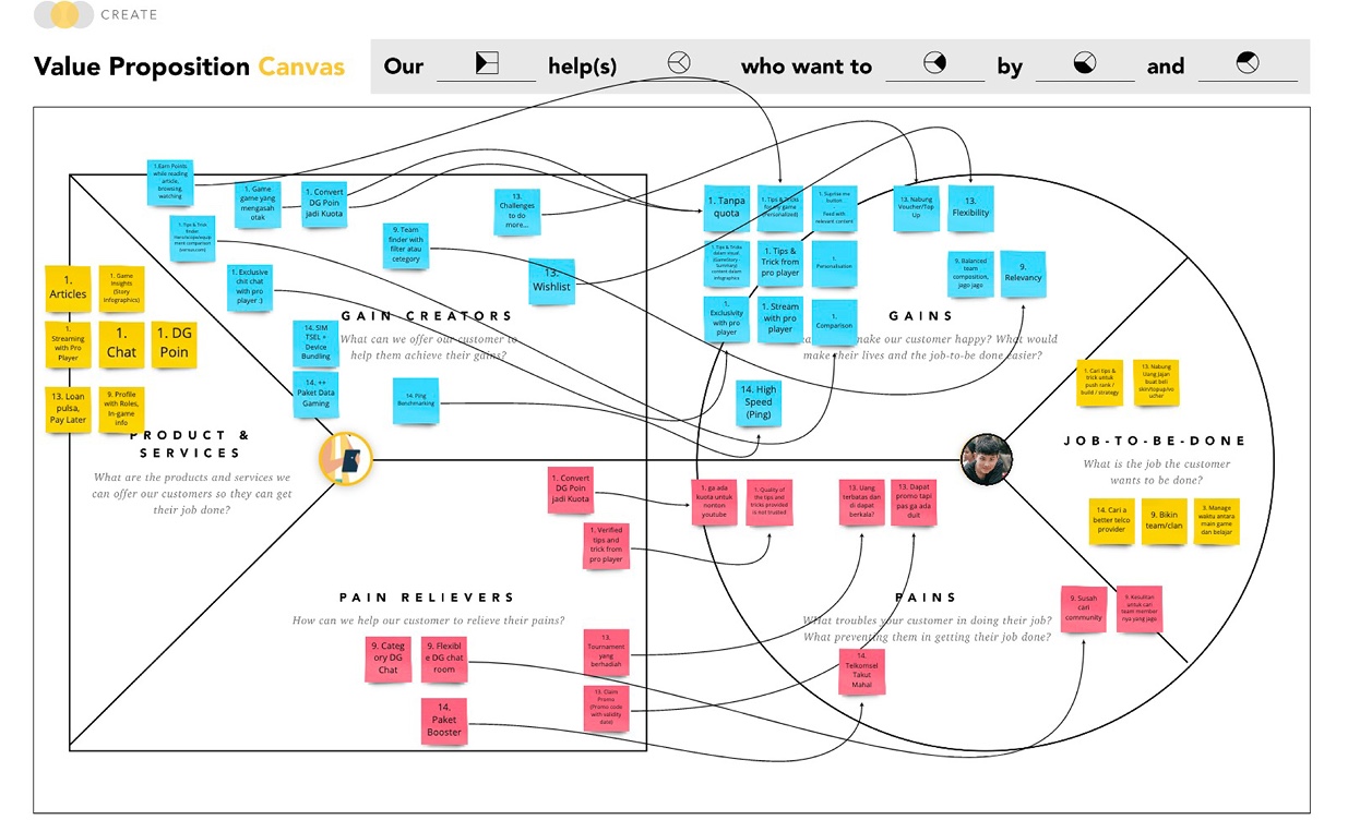
Value Proposition
We mapped what matters to users into a Value Proposition Canvas to align our ideas with their real needs.
Design Opportunity
The goal is to create a more interactive, community-driven platform that encourages user engagement beyond just transactions.
What We Focused On:
- Since most DG users visit from smartphones, we prioritized mobile-first design
- Built features and visuals that invite interaction and spark interest
- Ensured clear navigation and flow so users can complete tasks easily
- Added personalized content and recommendations to make each experience more relevant
We also reviewed and restructured the current Information Architecture (IA) to better support these goals and streamline user journeys.
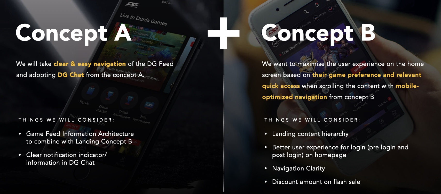
We iterated on the current design by creating Concept A and Concept B for key features. Each was used for A/B testing, allowing us to see what resonated best with users.
We took the strengths from both concepts and combined them into an improved version. Then, we conducted usability testing to validate the design.
Usability Test
We interviewed 13 users through virtual sessions to test our design. Each user was asked to complete a set of scenarios. We categorized the results into three groups:
✅ Direct Success – Users completed tasks without help
🔄 Indirect Success – Users needed some hints or guidance
❌ Fail – Users couldn’t complete the task
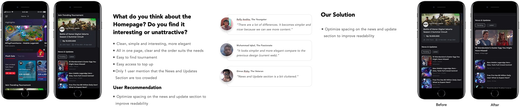
Most users completed tasks with ease. Feedback was also very positive, we received an average rating of 4.7 out of 5 for interactivity, ease of understanding, and ease of use.
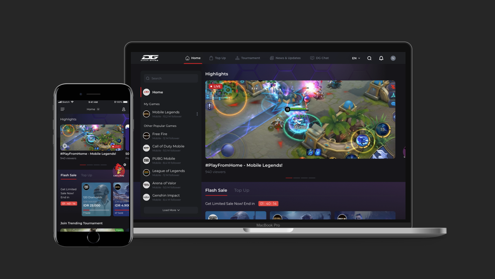
Below is an example of the home/landing screen, showing how we improved it based on user feedback during testing.
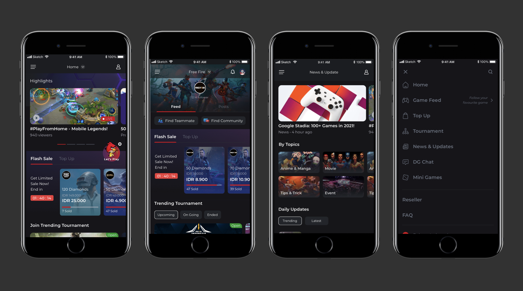
Final Design Screens
Here are some of the final screens after several rounds of user testing and iteration.
The website is designed specifically for gamers — using a bold, futuristic look with dark mode and high-contrast visuals. The goal is to create an exciting experience while keeping core features simple and easy to use.
I am open for collaboration, projects, and other exciting opportunities.